
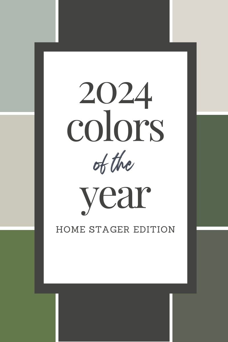
2024 Paint Colors of the Year - Home Stager Edition
As the new year approaches, the top paint companies have all announced their picks for the 2024 color of the year and we must say they are bold and intriguing. While some are useful for interiors, some…not so much. But is that really the point of the paint companies’ choices? That’s why we are back at it again this year with our top paint color picks for 2024 as well.
Pantone and the other paint companies tend to predict the color based upon the culture of the world at the time. They use this information to forecast trends for the upcoming year. Color experts come from a wide range of design, cultural and geographical backgrounds to decide on a color that reflects society as a whole both culturally and emotionally. This doesn’t always mean it’s the perfect color for your living room. (I mean most people probably don’t want a family room painted in Pantone’s 2024 color Peach Fuzz, right?). It’s simply a color that is symbolic of cultural society at present day.
Our job as home stagers is to acknowledge the trend but recommend paint colors that will resonate with a wide audience and remain stylish for several years to come. Our homes should be a reflection of us, but when it comes time to sell your home, just know you will need to appeal to vast array of buyers. Careful selection of color choices will allow you to enjoy and reflect your style, while also inviting others to love it as much as you do.
Let’s be honest, 2024 colors selected by the paint companies are somewhat of a 1980s island theme, with all the variations of blue and coral. I have visions of Fantasy Island and The Golden Girls each time I see these colors. (Hats off to Behr & Dutch Boy for their moody hues with Cracked Pepper and Ironside!). As much as we want to be swept away to the tropics or re-live our childhood watching Blanche, Dorothy and Rose banter back and forth sitting on their coral and teal rattan sofa, we believe we should recommend a more realistic approach to paint colors. Colors that will be on-trend but also universal and pleasing to a wide audience.
In this post you will hear LRV mentioned quite a bit. LRV stands for “Light Reflective Value”. Each color has a number ranging from 0-100. The number represents how much light the color will take on, therefore possibly changing its appearance. In order to get a better understanding of this paradigm, think of a pure white as having an LVR of 100 and a true black as 0. So, the darker the color, the smaller the LRV number and the lighter the color, the higher. Darker colors soak up light and lighter colors reflect it just like a black shirt soaks up the warmth of sunshine while a white t-shirt can keep you cooler on a hot summer day.
Alright, let’s get to it, shall we? And our 2024 color picks are…….

Leigh - Sherwin Williams Iron Ore
I went with a bold move this year. I think I may have traveled to the dark side. Sherwin William’s Iron Ore is a standout neutral. Dark color is very on-trend right now and this color does not disappoint. With an LRV of 6 this color is very, very dark and to the naked eye comes across as a true black against a stark white. However, it’s more of a charcoal and has a nice warm feel (kind of like a warm hug). It pairs nicely with creamy whites, beiges and browns while allowing a neutral backdrop for any pops of color. It creates the drama one may want or need in an interior space or on the exterior of the home (loooove it paired with wood and stone on exteriors!) Inside the home consider using Iron Ore for trim, doors or accent walls. Or even try it in your powder room (ceiling too) for a dramatic flair. You will thank me later.

Picture via Sherwin Williams
Wendy - Benjamin Moore Rodeo
I painted my new modern mountain house Rodeo by Ben Moore, which started out as a compromise between myself (I wanted white) and my husband (wanted an actual color). I was unsure at first, but now that I live in it, I'm amazed how much I love it. Rodeo is a warm gray taupe that is a perfect compromise between gray and beige. It's warm enough to go with natural wood tones and saddle leathers, but cool enough not to look muddy or brown. Its LRV sits almost neutral at 60 which means there’s not a lot of shift that happens. This is a fantastic neutral if you are unwilling to spend the $$ to update those natural wood floors or cabinets that look too orange with the more popular true grays. Its a bit unassuming in the sea of color swatches you'll see in the retail store, and anything but when you put it on the wall.
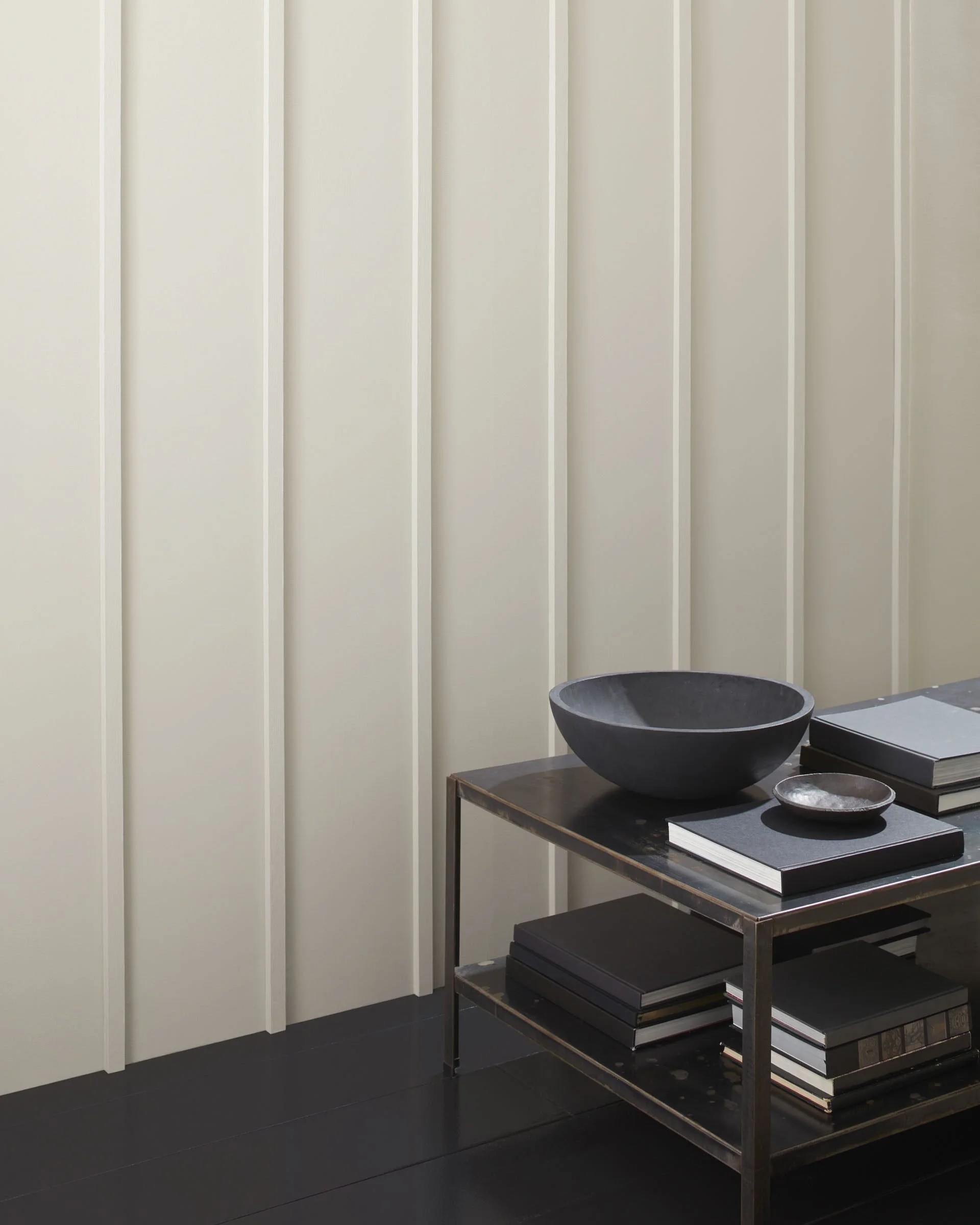
Picture via Benjamin Moore
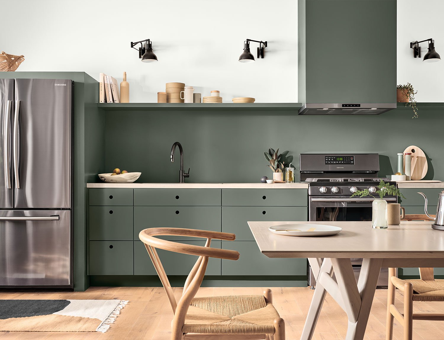
Alison - Benjamin Moore Herb Garden
I love all things green - it’s “Nature’s Neutral” - and it’s one of the few colors that I can commit to in an interior space without too much hesitation. (My co-workers will tell you I tend to run from color). Benjamin Moore’s Herb Garden is the color that checks off all the boxes for me. This color has an LRV of 17 so it is dark and holds its own with lighting. It will not sway. It’s the perfect balance: not too deep and dreary - and not too pale and pastel (gasp!) The cast is right where I like green to be - fresh, earthy, leafy - and not too blue. At that point it just starts to look like the color of the Philadelphia Eagles - and as the wife of a New York Giants fan, we can’t have that.

Picture courtesy of Noz Design
Kim - Sherwin Williams drift of mist
Looking for a nice neutral? Sherwin William’s Drift of Mist is my choice for this year. It’s not your normal, boring gray. However, its a little complex (aren’t we all?), because it is neither cool nor warm. It can wave back and forth, depending on what it is paired with in your fixed elements of the home like countertops and flooring. (Hmmm…sounds a lot like what I tell my kids happens with certain friends they hang out with the most). It’s LRV is 69 which means it is heading toward the lighter end of the scale. It makes for a great whole house neutral allowing for just enough pop with the white trim. If you’ve been a fan of Agreeable Gray (which isn’t very agreeable sometimes!), you will LOVE Drift of Mist. It’s lighter and brighter. It also has a little bit of a green undertone so if you love all the dark green tones that are trendy right now (swoon!), this color will look stunning with it. But you will find that it compliments many colors as well. As a result, it makes sense to paint your whole house a color that will withstand the ever-changing trendy colors in your decor. If you don’t want to commit to sterile white/cream walls but you don’t want gray or beige either - Drift of Mist is for you!
Picture courtest of The Creativity Exchange
Laura - Sherwin Williams Pewter Green
Is it a greyish green? Is it a greenish grey? I don’t know, but I am obsessed! With an LRV of just 12, this surprisingly neutral hue by Sherwin Williams is on the dark side, but still manages to keep things light. Pewter Green is extremely flexible, complimenting Grand Millennial’s busy wallpapers, Modern Farmhouse’s warm beiges, and Boho’s light wood tones. This color chameleon swings from soft and romantic to complex and moody (kind of like me!). In 2023, it has taken center stage on my kitchen island, made a grand entrance on my exterior doors (paired with pinkish brick, it’s a chef’s kiss!) and may soon make a guest appearance in my spare bedroom (get it - guest appearance?). With the number of compliments I have received, I think we will be seeing a lot of this color in 2024.
Picture via Sherwin Williams
Marlo - Benjamin Moore Sweet Basil
Benjamin Moore’s Sweet Basil is a classic color that works great with modern or traditional decor. It’s moody, soothing and it brings nature indoors. For someone like myself who loves to be outdoors hiking the trails, this color brings the feel of nature indoors. With an LRV of 13, it’s on the darker side making it moody and soothing but not so dark you feel like you’re in a cave. It’s a good color to create a pop for an accent wall or a powder room (we love to have a little creative fun in powder rooms!). It pairs so well with natural wood bringing more of that outside inside vibe to any space. It pairs well with blacks and creamy whites without bringing out any yellow undertones.
Miriam - SW Silvermist
Last but not least, let’s nod toward the paint companies’ efforts for their Caribbean flair, but in a nice neutral way. Silvermist was the August 2023 Color of the month choice for Sherwin Williams and is my color of choice for those wanting a coastal, modern vibe to their home. This color evokes an ocean feel but in a neutral way. With an LRV of 47, it falls in the medium-dark category. Its soft blue, green hues pair nicely with most beiges and grays, while standing out on its own. You can pair it with just about any of the other colors mentioned by our staff. Silvermist adds coastal, casual, calmness to any space whether it be an accent wall, the main feature or just in accessories to lighten up darker spaces. Sorry paint companies, but this is my pick for island serenity as I dream of breezy ocean air.

Picture courtesy of Sherwin Williams
That’s a wrap with our 2024 paint colors. Though each of our colors were chosen individually, collectively we all leaned toward green undertones. That must say something about trend worthy design!
Whether you are selling or staying in your home, it’s important to acknowledge trends while staying neutral in your paint selections. You can have more fun, and less expense, with trendy colors through your accessorizing - so go out and buy that Persimmon pillow but don’t paint your wall that color!
We strongly encourage homeowners to sample these colors (or any for that matter) in their own homes as light and fixed elements play a huge role in how a paint color appears in a home. No one wants to waste time or money so it’s important to get it right. If you are looking for a refresh in your home, but don’t know where to begin, we offer Color Consultations for selling AND living! Just go online and book your appointment today.
Let us shine a spotlight on your home!
