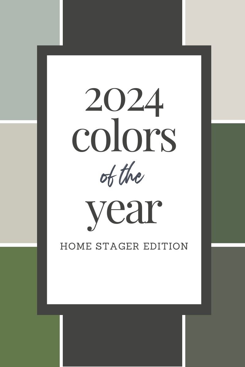
Back by popular demand, we present Staged by Design’s 2025 Colors of the Year, Home Stager Edition.
We are often asked the question, “What’s the best color for my home, my listing, my one-bedroom condo with limited light, etc”. This is a difficult, if not impossible question to answer, as so many factors go into selecting paint colors. We take into account the amount of natural light, countertops, cabinets, and flooring at a minimum, to ensure cohesive flow and coordination. It is also crucial to understand that colors look drastically different based upon the light. Pro Tip - avoid cool or daylight bulbs as they skew your paint colors.
We started our Colors of the Year, Home Stager Edition a few years ago to help bring contrast to the Paint/Pantone Colors of the Year, which often reflect anything from economic conditions to emerging fashion trends. Those choices can become popular, or simply fade away.
Our pics for 2025 are approachable, on-trend, and suitable for both real estate and design, but are by no means a one-size fits all approach. As we always recommend, you MUST try these selections in your home to see how the colors “read” on YOUR walls, in bright light, low light, daytime and nighttime before deciding if the shade is right for you.
Color drenching is a term you should familiarize yourself with, as it is HOT right now. Color drenching is an interior design technique that involves painting an entire space with a single color or a closely related group of tones. It’s an entire mood, and if you are feeling it, we say paint with confidence! We reference it with a few of our more saturated tones.
For resale, it is always better to be conservative in your selections, and we have included those as well. We feel this year’s palette represents the following: moody, earthy, organic and fresh.
Let’s color 2025 in a positive light with these refreshing colors!
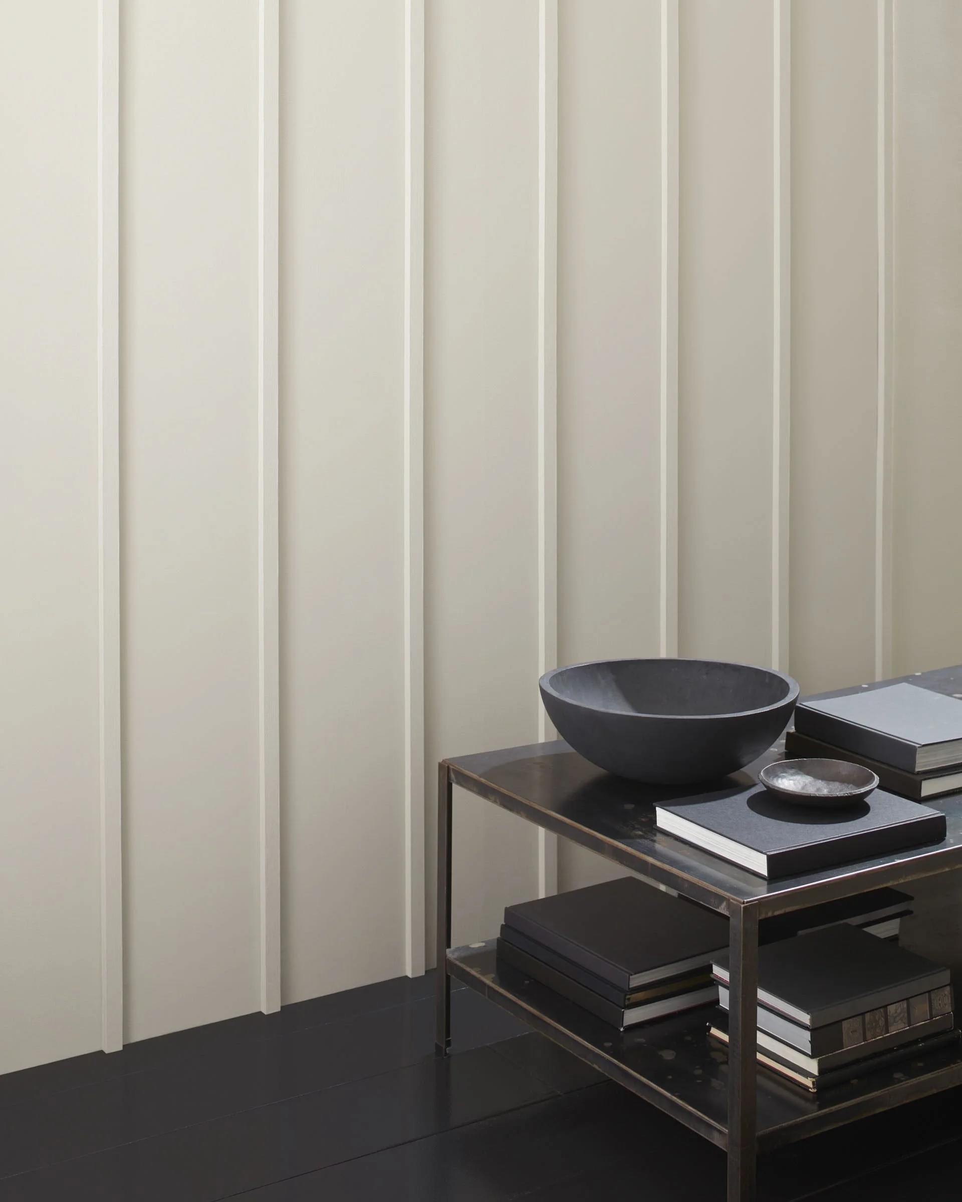
Leigh: FRENCH CANVAS bENJAMIN MOORE 1514
French Canvas is a bit of a chameleon, with beige, green and gray undertones. This can feel both modern, yet timeless at the same time.

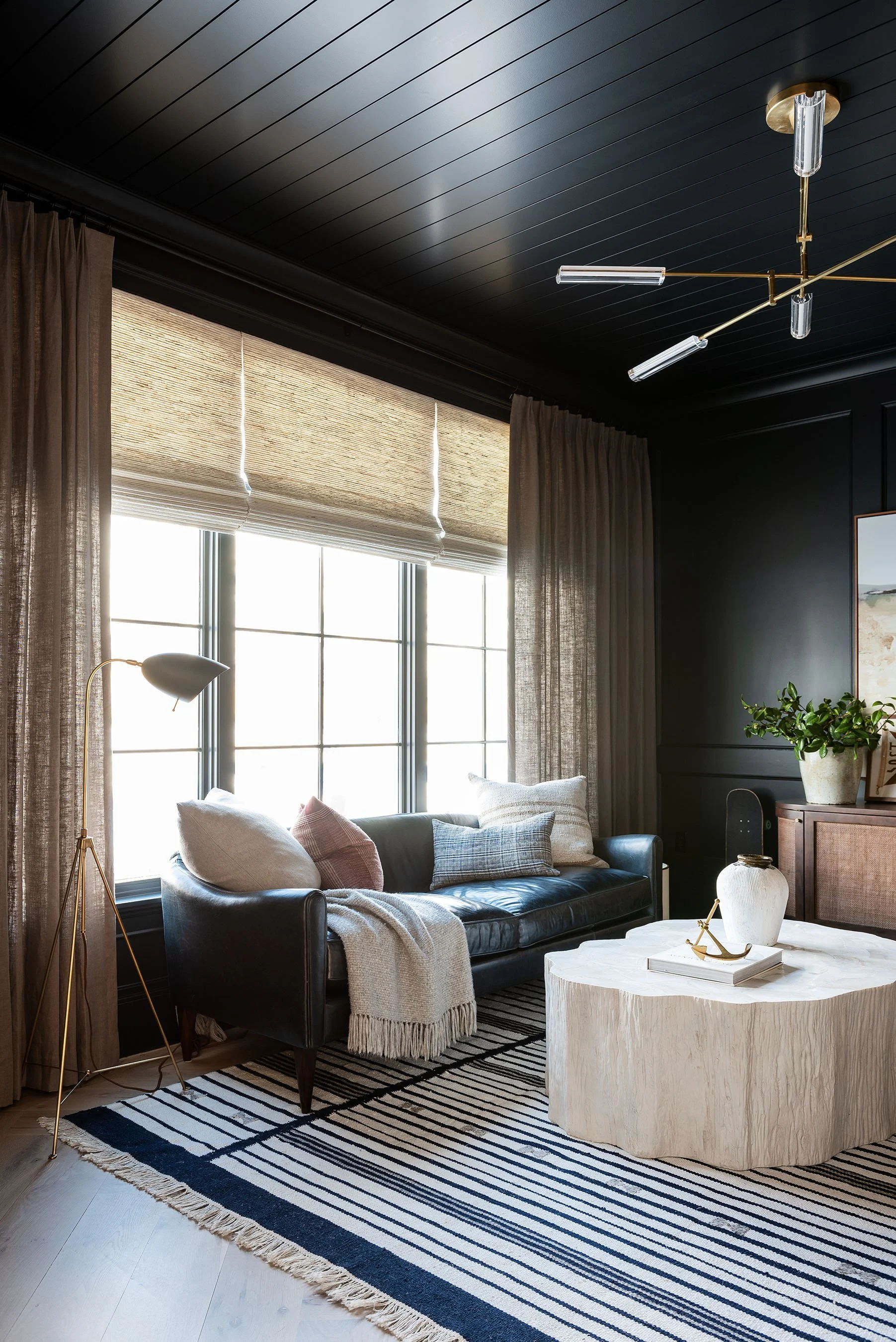
Photo credit: DVD Interior Design
CONTENTEd SHERWIN WILLIAMS SW6191
Contented: This soothing green has blue/gray undertones for a calming space. A perfect color to embody Quiet Luxury.

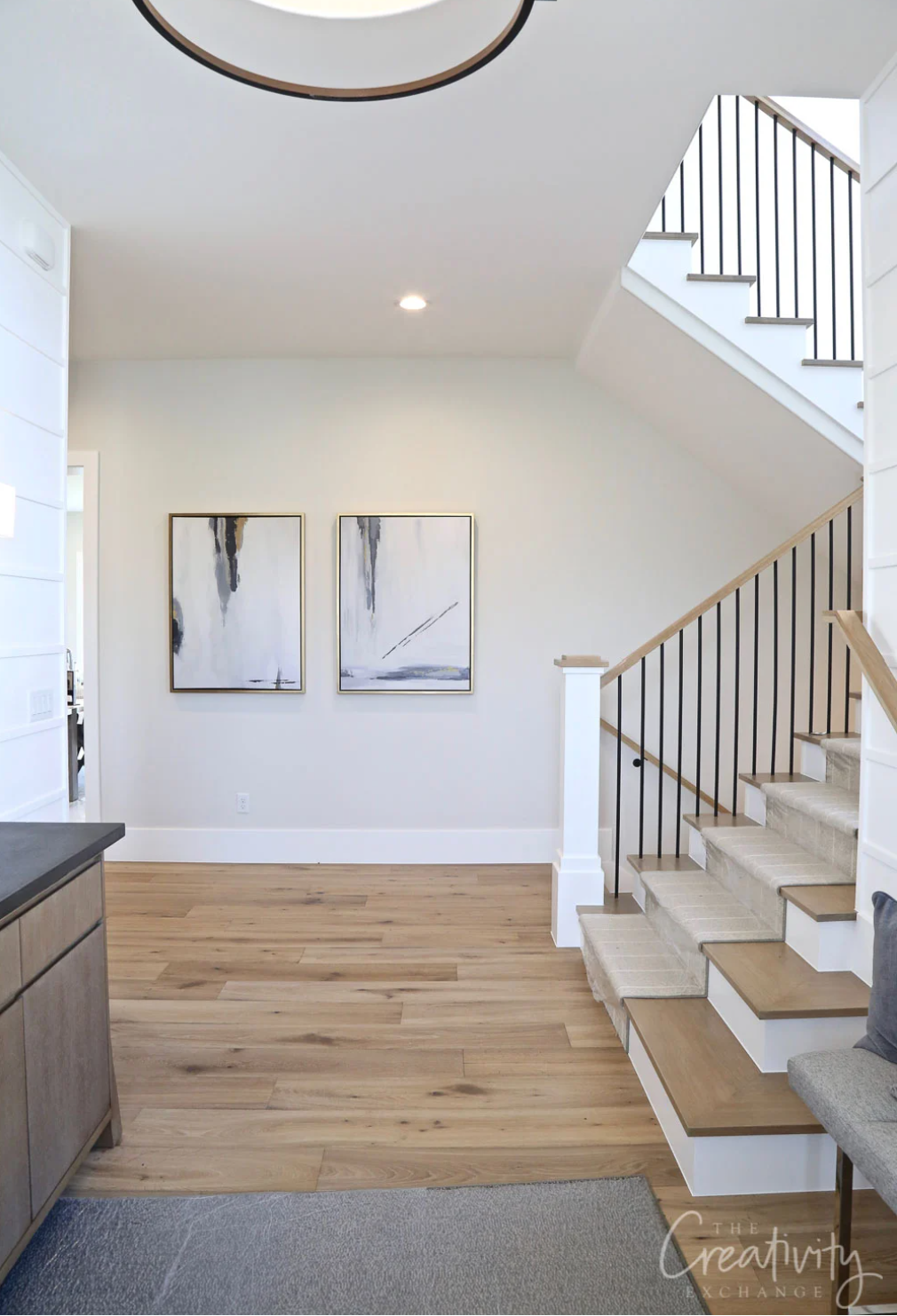
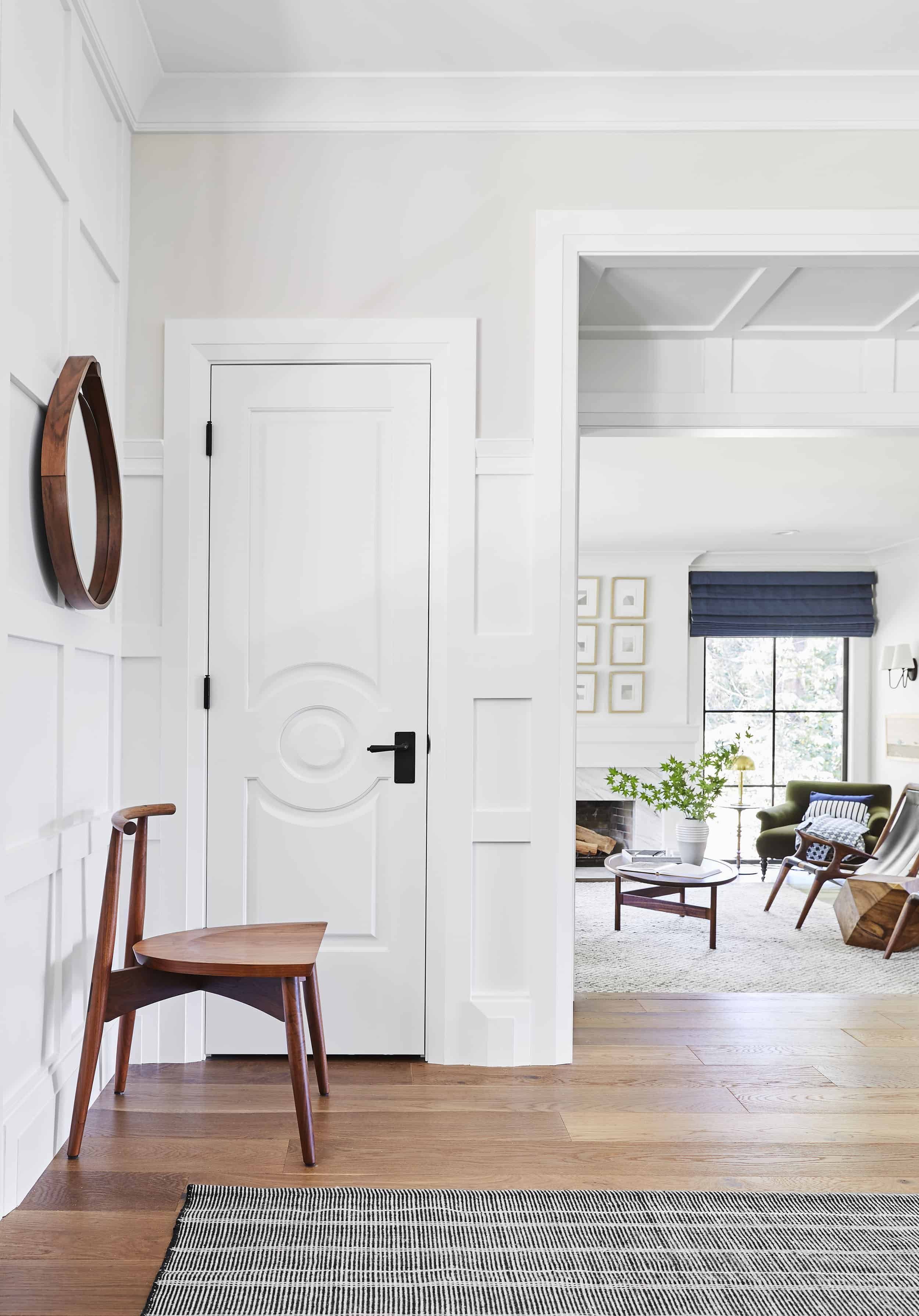
Alison: REPOSE GRAY SHERWIN WILLIAMS SW7015
Repose Gray: An oldie but a goody! This color leans as a warmer neutral with green and taupe undertones - but less warm than its beloved cousin, Agreeable Gray (secretly still my favorite neutral!)

Photo credit: Studio McGee
GREENBLACK SHERWIN WILLIAMS SW6994
Go bold or go home. Greenblack makes a striking statement. A cool black with a hint of green undertone - perfect for a dramatic accent wall (and for those of us afraid to use too much color!)
Marlo: yorktown green benjamin moore HC133
Yorktown Green: Dark, yet sophisticated, with undertones of teal, blue green and gray. Basically, a green with a little mystery….

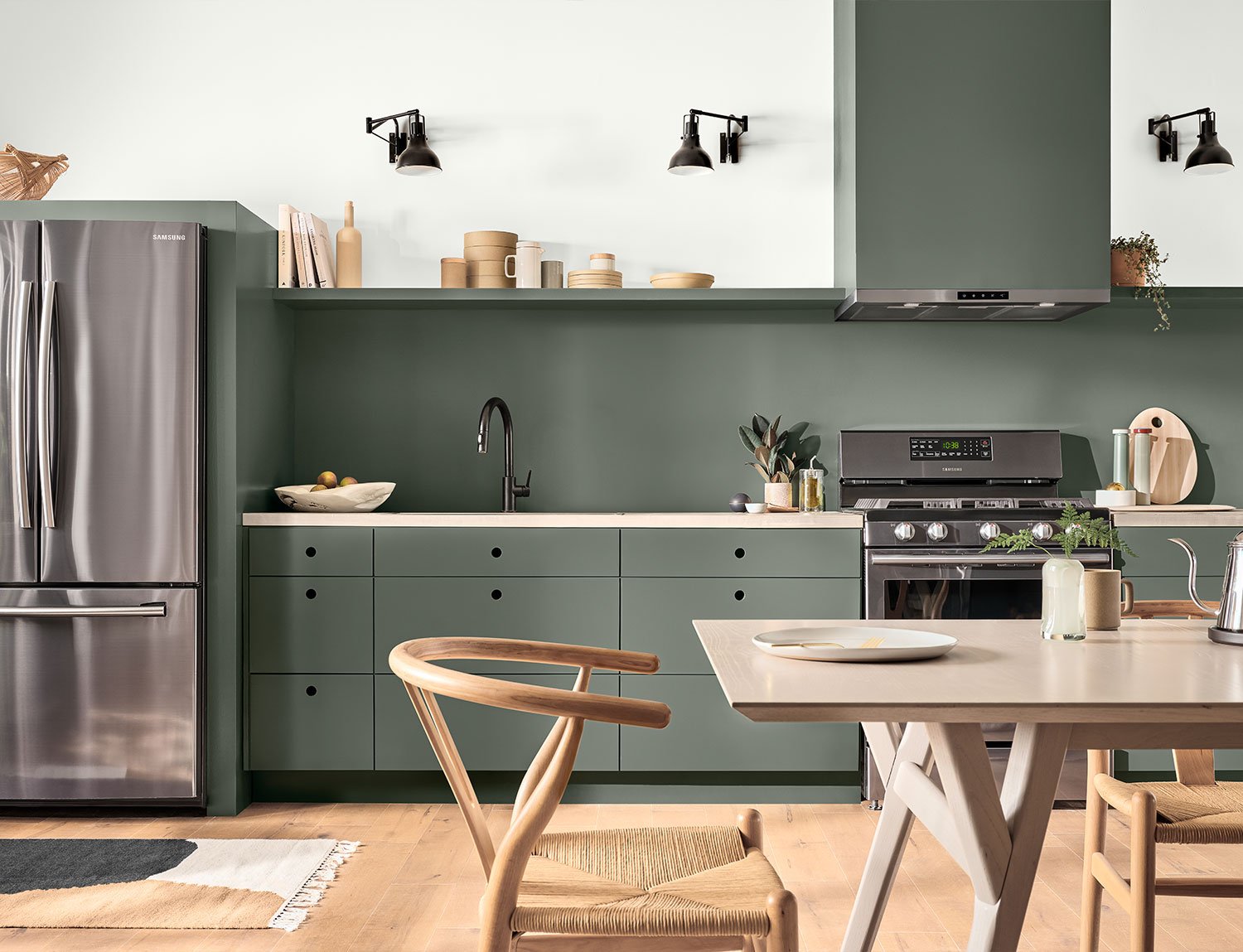
Army green Benjamin moore 2141-30
A more interesting green, Army Green is somewhat neutral and can easily blend well with other color palettes. Great for an office, bedroom, powder room or accent wall.
MARIA: ALABASTER SHERWIN WILLIAMS SW 7008
A soft white that’s warm and balanced, Alabaster is a great contrast to darker grays.

Photo credit: Nicola’s Home
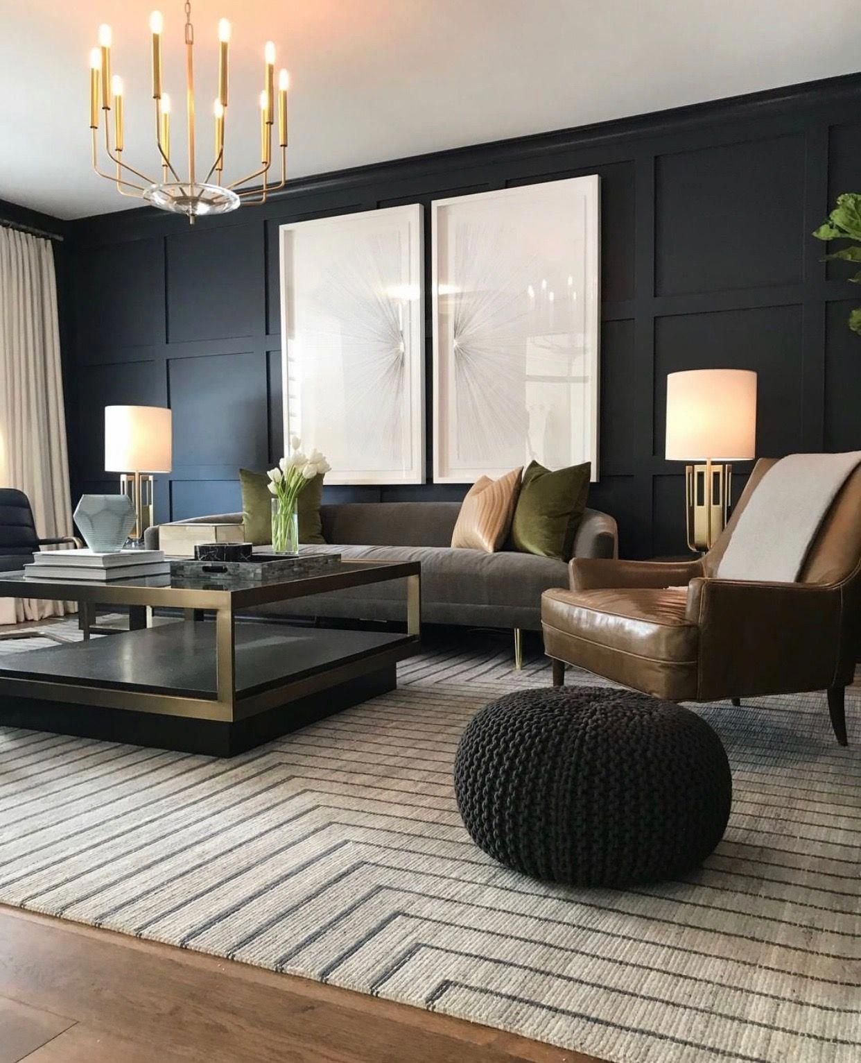
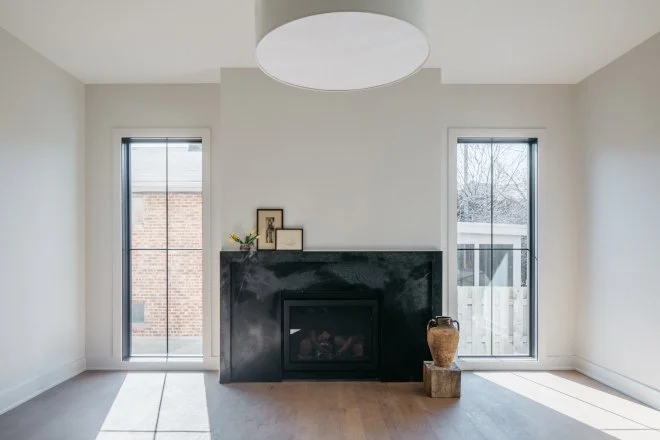
URBANe BRONZE SHERWIN WILLIAMS SW7048
Urbane Bronze This striking color has subtle earth tones with its combination of gray and brown, evoking a sense of tranquility. It is dramatic and full of depth when used as an accent wall or on built-ins or fireplace surrounds.

wendy: oragmi white sherwin williams sw7636
Origami White: Bright, but not TOO stark, this pairs beautifully with blacks and brighter whites on trim.
thunderous sherwin williams sw6201
Thunderous: Green undertones without being overtly green, with enough gray to make it flexible. Perfect for color drenching.

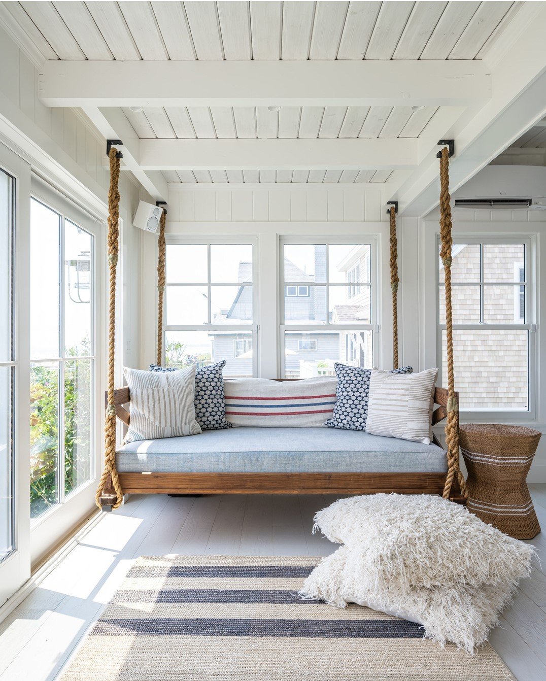
RACHEL: sNOWBOUND SHERWIN WILLIAMS SW7004
Snowbound: This lovely shade is a bit of a cooler white with gray undertones and can be described as a designer white with quiet comfort.

stardew sherwin williams SW9138
Stardew: A calming and luxurious blue with warm and cool undertones. Outstanding both for exteriors and peaceful interiors.

There you have it-our paint color picks for 2025 - or any year for that matter. These timeless classics will be a safe win for any homeowner. (However, we always advise homeowners to sample colors in their own homes as light plays a huge role in how a color shows in a home.). If you are looking for a refresh in your home, but don’t know where to begin, we offer color consultations for selling AND living! Just go online and book your appointment today.
Let us shine a spotlight on your home!